
Wounded Warriors Canada
Sustained Support Initiative
Creating a seamless and engaging donor experience to appeal to a new generation
(Group Project, 5 members)
Project Overview
Wounded Warriors Canada is a national mental health service provider dedicated to serving Trauma Exposed Organizations, Trauma Exposed Professionals and their families. WWC specializes in providing culturally informed services that utilize a combination of education, counselling, and training approaches to support resiliency and recovery from post-traumatic injuries.
In their first meeting with our class, Wounded Warriors Canada expressed various concerns regarding the number of donors and the retention of said donors, as it was insufficient to fund the necessary programs for the communities they serve. This resulted in waitlists of 1-2 years and a major reduction in marketing to avoid an even longer waitlist. Among these concerns, they also mentioned their need to appeal and gain the retention of a younger donor demographic. However, it was unclear to our team what their exact priority was between the various pain points brought up and how they connected.
As the contact person to the client for our group, it was my top priority to book a meeting with the client to pinpoint their goals and focus. When we met, they explained their top priority was attracting and retaining donations from a younger demographic, as most of their core donor base was reaching or already retirement age and thus would no longer be able to donate. However, they mentioned how younger people's perception of military forces makes engaging them a difficult task. While it is an aspect of society beyond the scope of any UX team, it was still a concern we would try our best to address. By gaining donations from a younger demographic, it would be possible to fund their programs more, thus reducing the waitlist and solving most of the issues they previously discussed.
My Roles
Methods
Contact Person
Researcher
Presenter
Comparative Analysis
Heuristic Evaluation
Usability Testing
Card Sorting, Stakeholder Meeting
Tools
Trello
Figma
Proven by Users
Microsoft Word
Duration
January - April 2026 (3 Months)

Research & Ideation
After determining our scope based on the client interview meeting, we devised various research methods to help gather information on the website and user/donor experience to understand what need to be done to accomplish our goal of engaging a younger demographic and improving their donor experience. Please see our process below.
We conducted five usability tests with Wilfrid Laurier University students who fall within the younger demographic (under 35 years old) that Wounded Warriors Canada hopes to reach. Participants were asked to complete three tasks: Find the Wounded Warriors Canada website, Locate information about donating to the Trauma Resiliency Program and Find the “24 Hours of Heroes” event
Usability Testing
We chose usability testing as it allowed us to directly observe users, particularly young people, navigating the site while they voiced their concerns. We also took note of their actions on the site.
Most participants were able to find the donation information relatively quickly. However, the third task revealed major navigation challenges. Many users struggled to locate the “24 Hours of Heroes” event because it appeared under an unexpected section of the website. Some participants found the event by accident while browsing other pages, while one participant was unable to complete the task entirely.
Allowed us to directly inspect the Wounded Warriors Canada website based on UX metrics like accessibility and clarity to see what areas the site is lacking in and what can be done to improve it.
Heuristic Evaluation
Navigation and information architecture could be simplified and the lack of a search function reduces efficiency. Some terminology may create confusion for new visitors. Screen reader usability is limited due to missing form labels and alt text. Heading structure inconsistencies may make navigation more difficult for assistive technologies. Low contrast on buttons may reduce visibility for some users.
Our team conducted a heuristic evaluation of the website using Nielsen’s 10 Usability Heuristics and an accessibility audit was conducted using the WAVE accessibility tool alongside WCAG 2.1 guidelines.
Comparitive Analysis
Allowed us to directly compare Wounded Warriors Canada to other leading not-for-profit groups to see that method and design details allowed them to be as successful and bring to the Wounded Warriors Canada website.
We compared the Wounded Warriors Canada website with nonprofit websites such as the Canadian Red Cross to identify design strategies that support clearer navigation and more effective donation experiences.
Clear calls-to-action help guide users toward actions such as donating. Structured content improves readability and usability. Impact statements help users understand how their donations support the organization.
Ensuring that our project and its direction aligned with the client’s goals and desires was essential. Keeping in consistent touch ensures that issues that arise or misdirections are dealt with
Stakeholder Meeting
I met with representatives from Wounded Warriors Canada to better understand the organization’s goals, fundraising strategies, and challenges related to their website and donor engagement.
When we met, they explained their top priority was attracting and retaining donations from a younger demographic, as most of their core donor base was reaching or already retirement age and thus would no longer be able to donate. Through that gained support, it would be possible to fund their programs more, thus reducing the waitlist and solving most of the issues they previously discussed.
Why we chose it
After conducting all the research we needed, we found the site’s main issues to be that the navigation structure is cluttered and difficult to scan, with events and certain resources difficult for users to locate. Accessibility barriers may limit usability for some users, such as the lack of compatibility with screen readers.
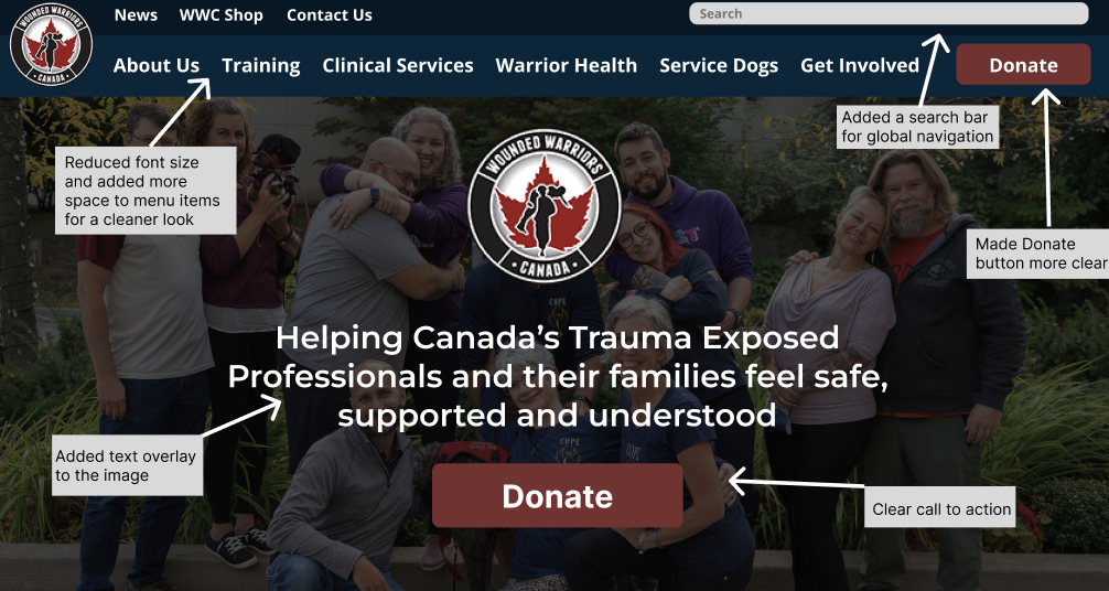
When creating the wireframes (Figure 1) we made the following changes:
Improving the visibility of important content, such as events and donation opportunities.
Reducing large blocks of text and organizing information into smaller, more readable sections.
Using clearer calls-to-action and visual hierarchy to guide users toward important actions.
More transparency surrounding where donations go is also important to entice potential donors.
Next Steps
How we did it
What we learned
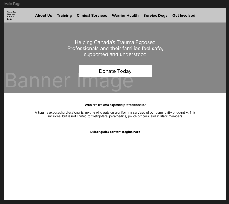
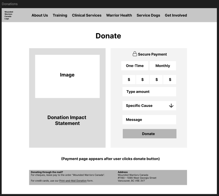
Figure 1: Wounded Warriors Canada Website Redesign Wireframes
Gathering Feedback
We collected feedback from a mix of classmates, peers within our target demographic, our professor, and our client. Classmates and peers participated in usability testing by completing tasks and thinking aloud, which helped us understand how they interpreted the prototype and identify areas of confusion in real time. Our client provided feedback on the overall direction of the project, emphasizing the importance of attracting younger donors and improving the donation experience, which helped us focus our design decisions on awareness, trust, and engagement. Our professor also gave feedback on the completeness of the experience, suggesting we add a post-donation confirmation page and follow-up communication to create a more complete donor journey. In addition, the card sort acted as another form of feedback by showing how users naturally group content, which helped validate and strengthen our navigation structure (See Figure 2 & 3)
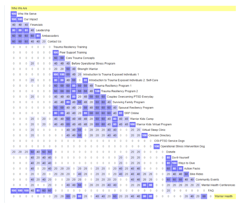
Figure 2: Card Sort Similarity Matrix
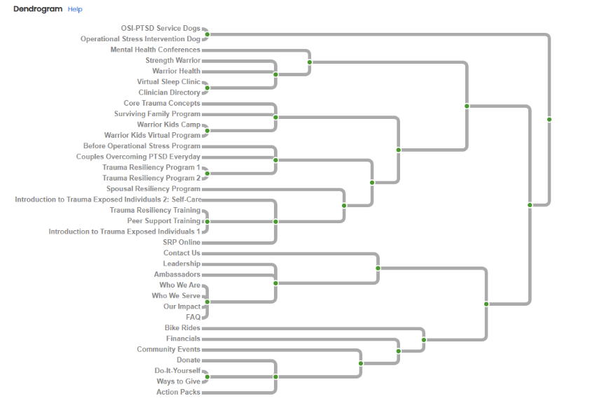
Figure 3: Card Sort Dendogram
We made the following improvements when moving on to our final design:
Added a clear definition and examples of “trauma-exposed professionals” on the homepage to improve user understanding.
Narrowed the project scope to focus on the younger donor experience based on client feedback.
Included an Instagram post example to support awareness and engagement among younger audiences.
Improved navigation by adding a global search bar and making the Donate button more prominent.
Redesigned the donation page to appear more professional, trustworthy, and impactful.
Added clearer messaging about how donations are used and why they matter.
Expanded the donor journey with a post-donation thank-you page and follow-up email communications.
Refined the prototype using feedback from users, the client, and the professor to better support user needs and organizational goals.
Validated and improved the overall user experience through evaluative research and usability testing.
Final Design
All our research, prototyping and feedback led us to our final designs (Figures 4, 5 & 6). An interactive version of the prototype is available by clicking the link to the right (will lead to to the Figma website) or a static version can be seen in Figure 4. Our Instagram post (Figure 5) and the newly added follow-up email template created by me (Figure 6) can also be seen below. Notes explaining design decisions are located throughout the prototypes where relevant.
For the follow-up emails (Figure 6) it was important to me to not just serve as a confirmation of your donation but directly connect the donor to more opportunities to volunteer and assist in their local community based on the donor’s location. It was also important that donors see where their money went once it was used, so it communicates how valuable said donation was, rather than feeling like it had no effect. In said email, the same connections to other opportunities are below.
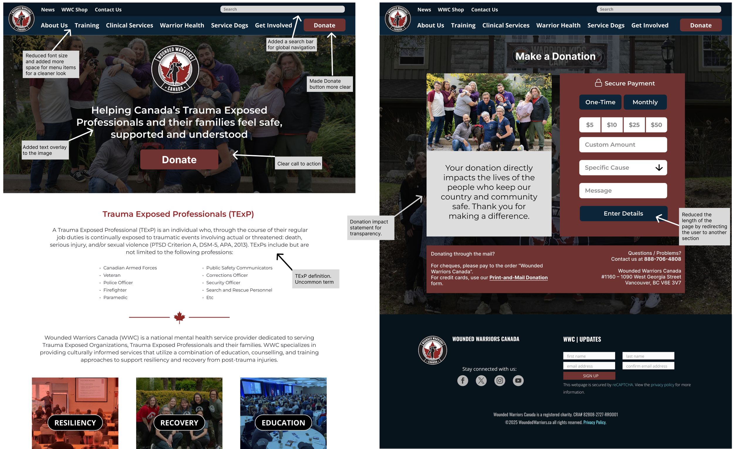
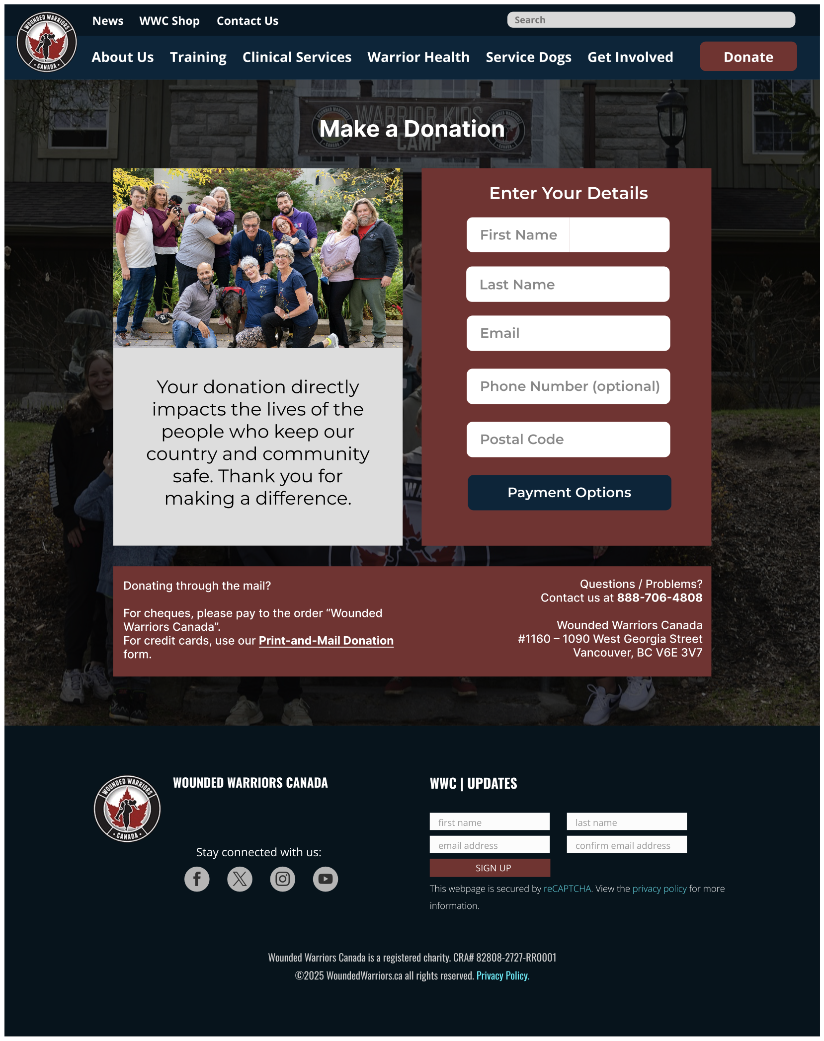
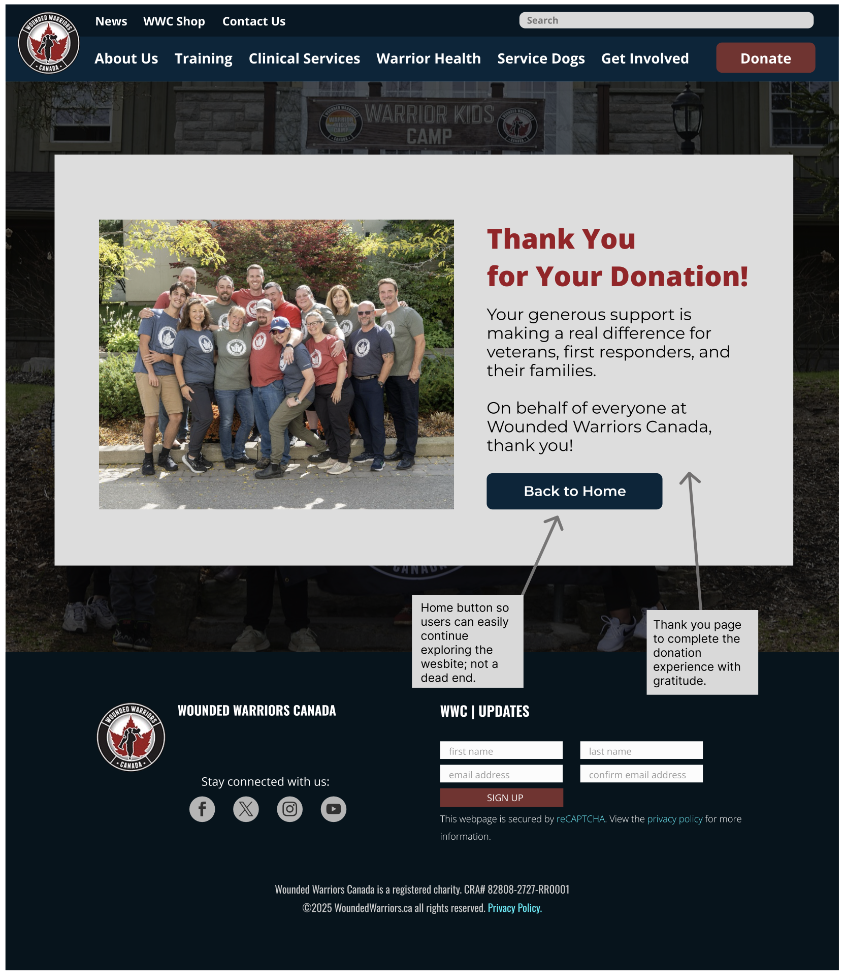
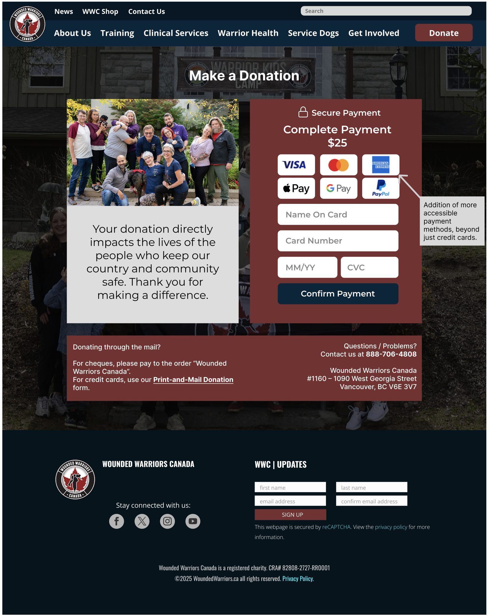
Figure 4: Wounded Warriors Canada Website Redesign
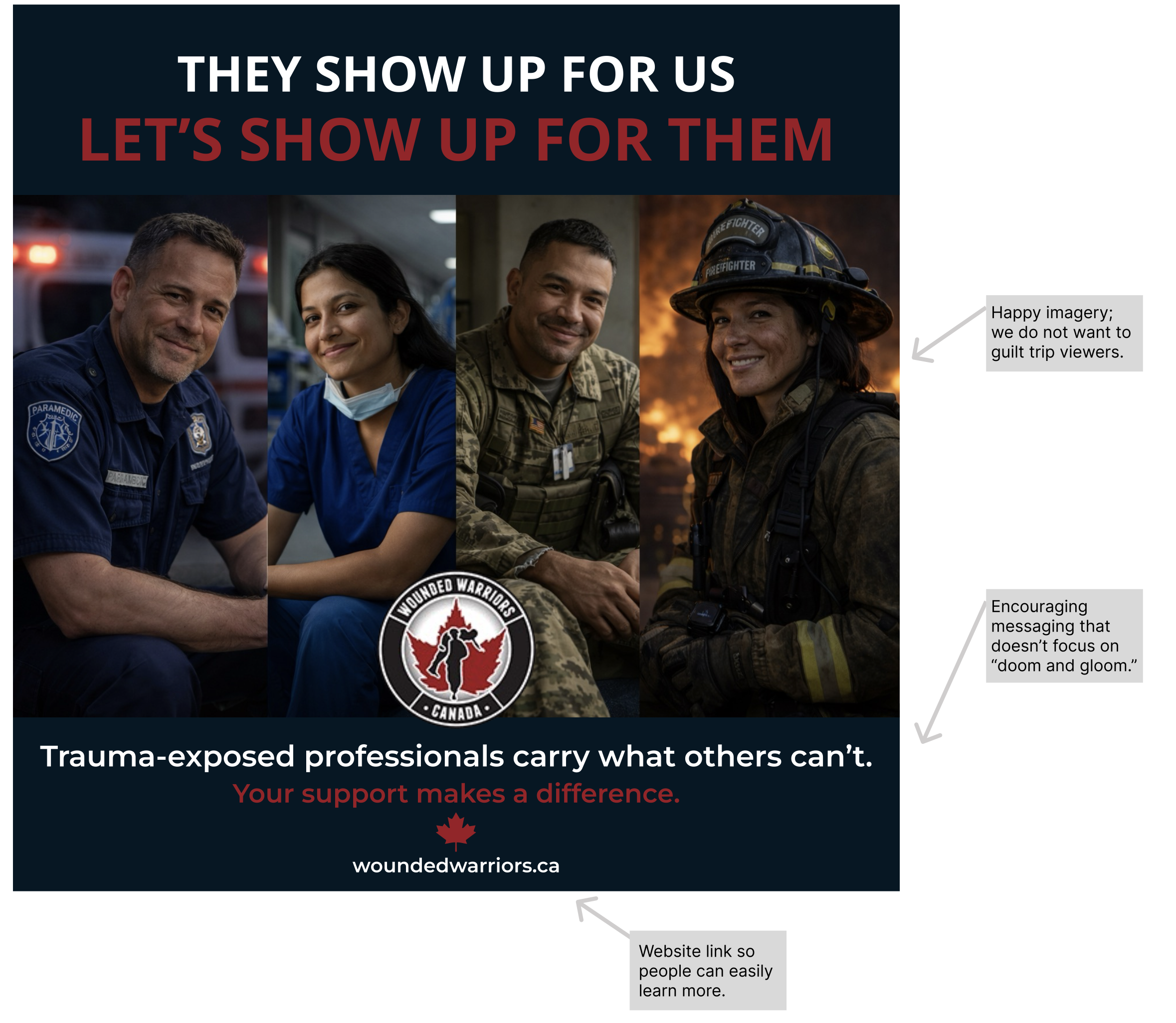
Figure 5: Wounded Warriors Canada Instagram Ad
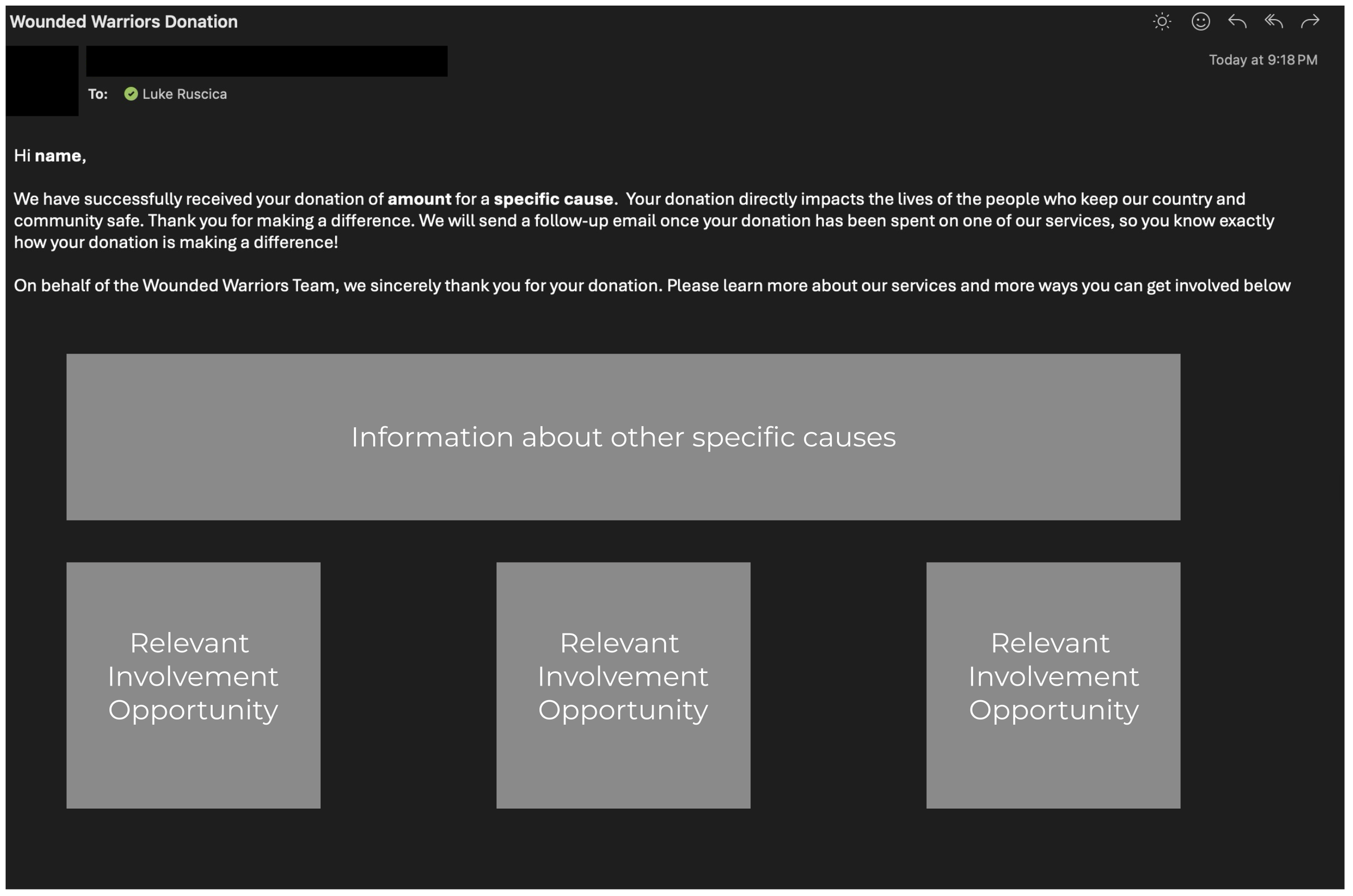
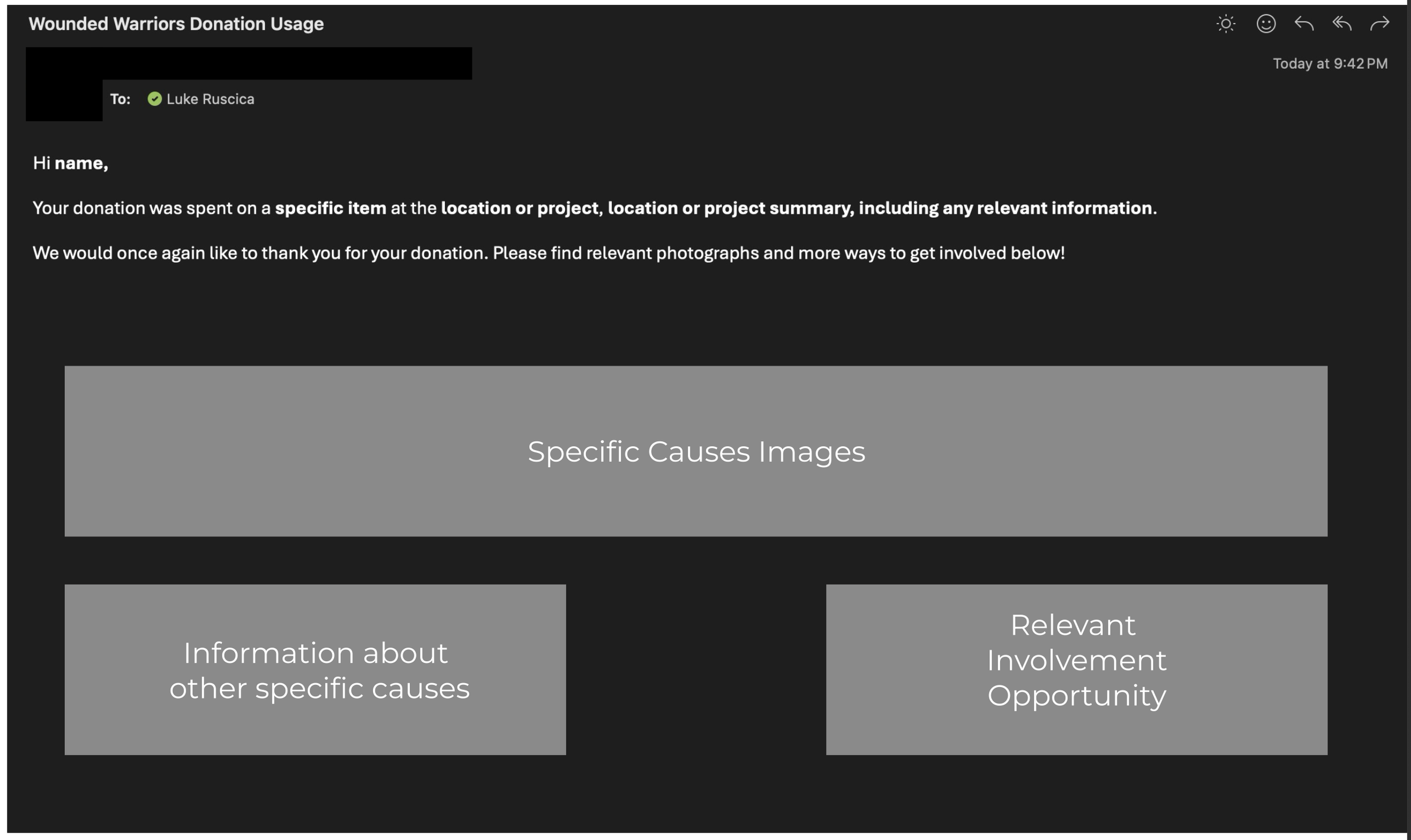
Figure 6: Wounded Warriors Canada Follow Up Emails
Before
After

Reflecting
When presenting our prototype to the client, they seemed happy with our direction and ideas, but noted that implementing more seamless transaction forms like Apple Pay is difficult because of the need to get the license and the fees collected by the provider.
Looking back on the project, while the rest of the team and I were satisfied with the results, however, if allowed more time we would have been able to expand our scope. We would have liked to do a website redesign and more social media material, specifically to counteract the negative perception of the military, but given the time, we did what we could.
For me personally, I would have loved the opportunity to continue implementing and help Wounded Warriors Canada attract more donors. As a UX designer, I want and hope to be able to help more non-profits help accomplish their goals and bring the change to the world we all want to see.